“We work to give art enthusiasts a more in-depth look into the contemporary side of Japanese art. We want to bring about the debut of many aspiring Japanese contemporary artists to the world.”
- KamiノKi brand statement
- KamiノKi brand statement
Logo Mark
CONCEPT
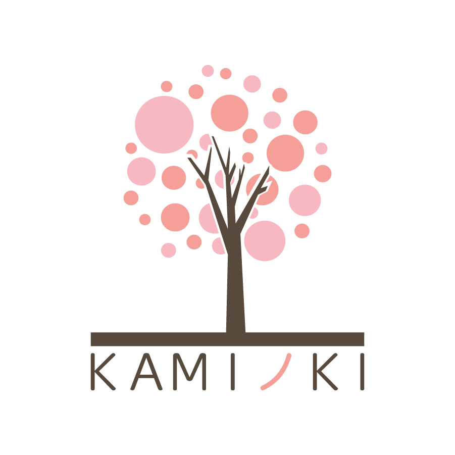
KAMIノKI (Kami No Ki), meaning the paper tree is a fictional art foundation that is envisioned to be the Guggenheim and the Broad’s Japanese counterpart. The brand’s visual identity is built on a play of dots similar to the EnChroma test, creating a dynamic shape that resembles a wide array of creative discipline that it represents while applying a counter optical effect that nicely ties into the idea of unity.
KAMIノKI (Kami No Ki), meaning the paper tree is a fictional art foundation that is envisioned to be the Guggenheim and the Broad’s Japanese counterpart. The brand’s visual identity is built on a play of dots similar to the EnChroma test, creating a dynamic shape that resembles a wide array of creative discipline that it represents while applying a counter optical effect that nicely ties into the idea of unity.
Instead of the usual stark contrasting colours, I used an analogous set of pinks to resemble Japanese cherry blossoms’ colours.
The reason I opted for a Japanese cherry blossom tree goes beyond the cultural imagery of tree itself, but for hanami, a Japanese flower viewing custom that is often a cause for people to gather together on a celebratory feast in appreciation of the flowers.

Secondary Logo Mark
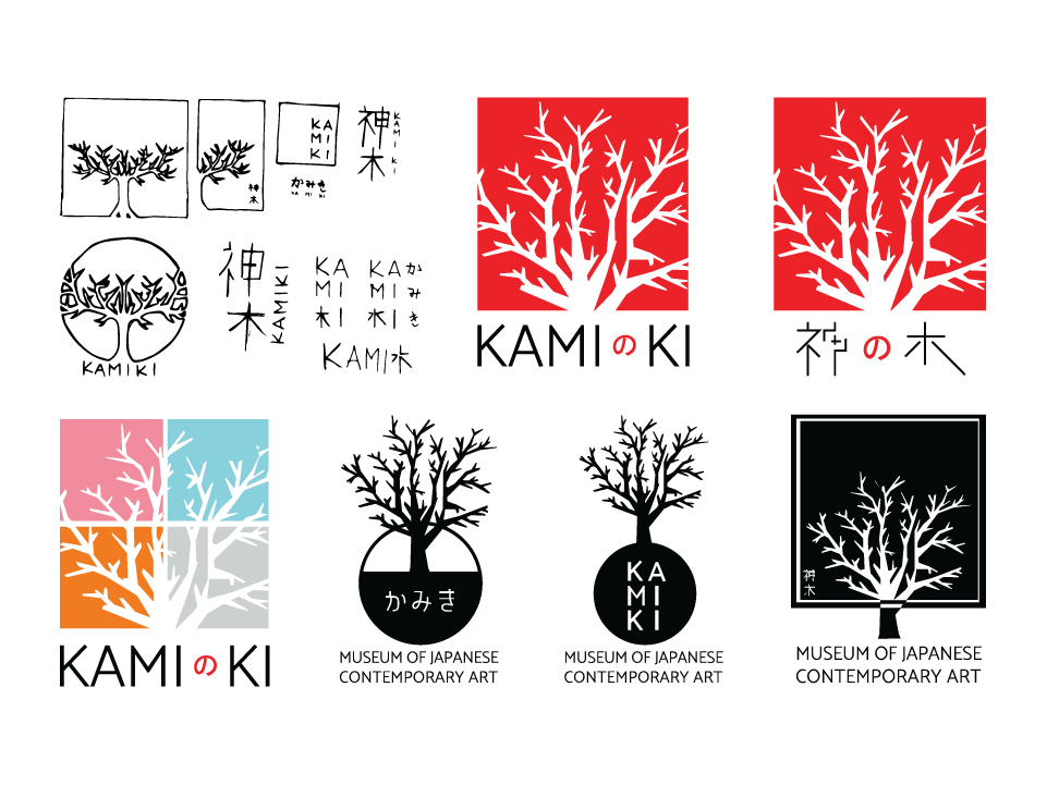
Sketch Exploration
APPROACH
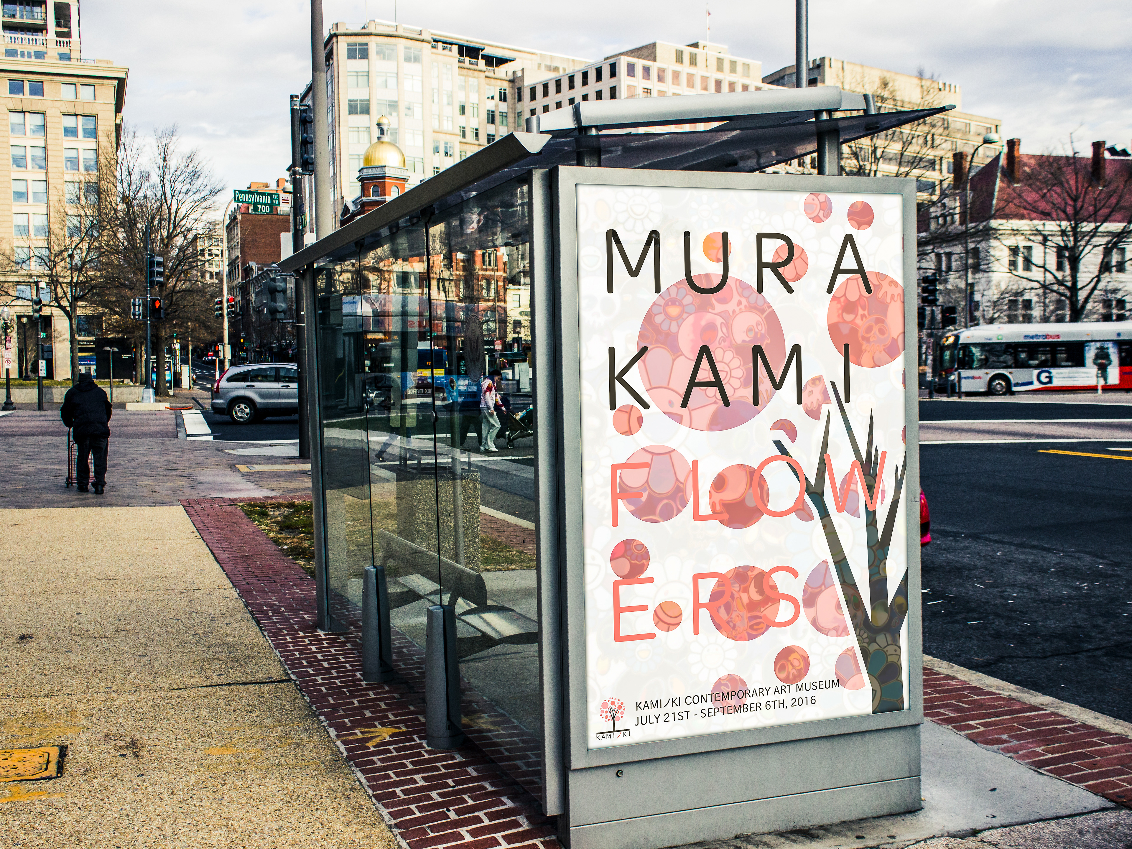
The identity design of KamiノKi founds its roots in the minimalist nature of contemporary art. Being of Japanese origin, much of its design element is inspired by Japanese contemporary artists such as Takahashi Murakami and Kusama Yayoi. These inspirations manifest itself in a tree pictorial with the mix of simple geometries in the cherry blossoms and a more complex shape in the tree trunk and branches that blends into a flat base on top of the brand name.
The identity design of KamiノKi founds its roots in the minimalist nature of contemporary art. Being of Japanese origin, much of its design element is inspired by Japanese contemporary artists such as Takahashi Murakami and Kusama Yayoi. These inspirations manifest itself in a tree pictorial with the mix of simple geometries in the cherry blossoms and a more complex shape in the tree trunk and branches that blends into a flat base on top of the brand name.
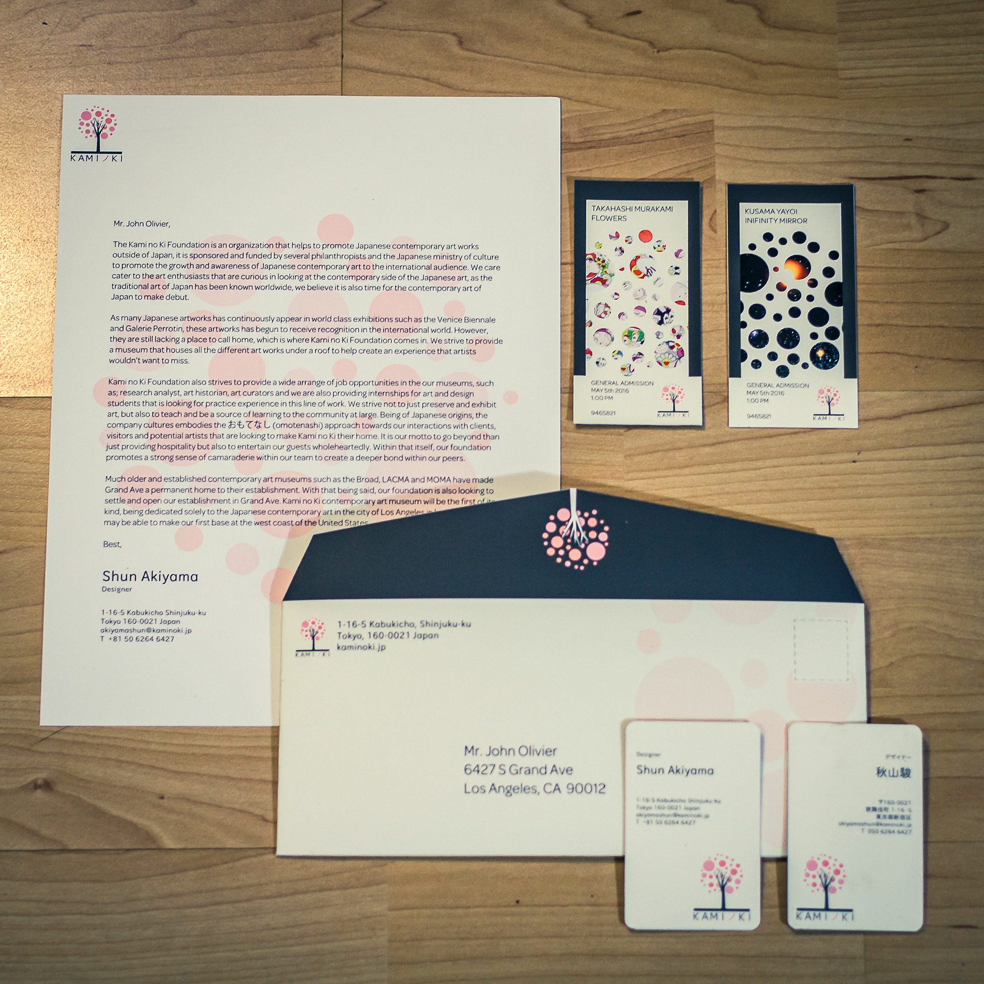
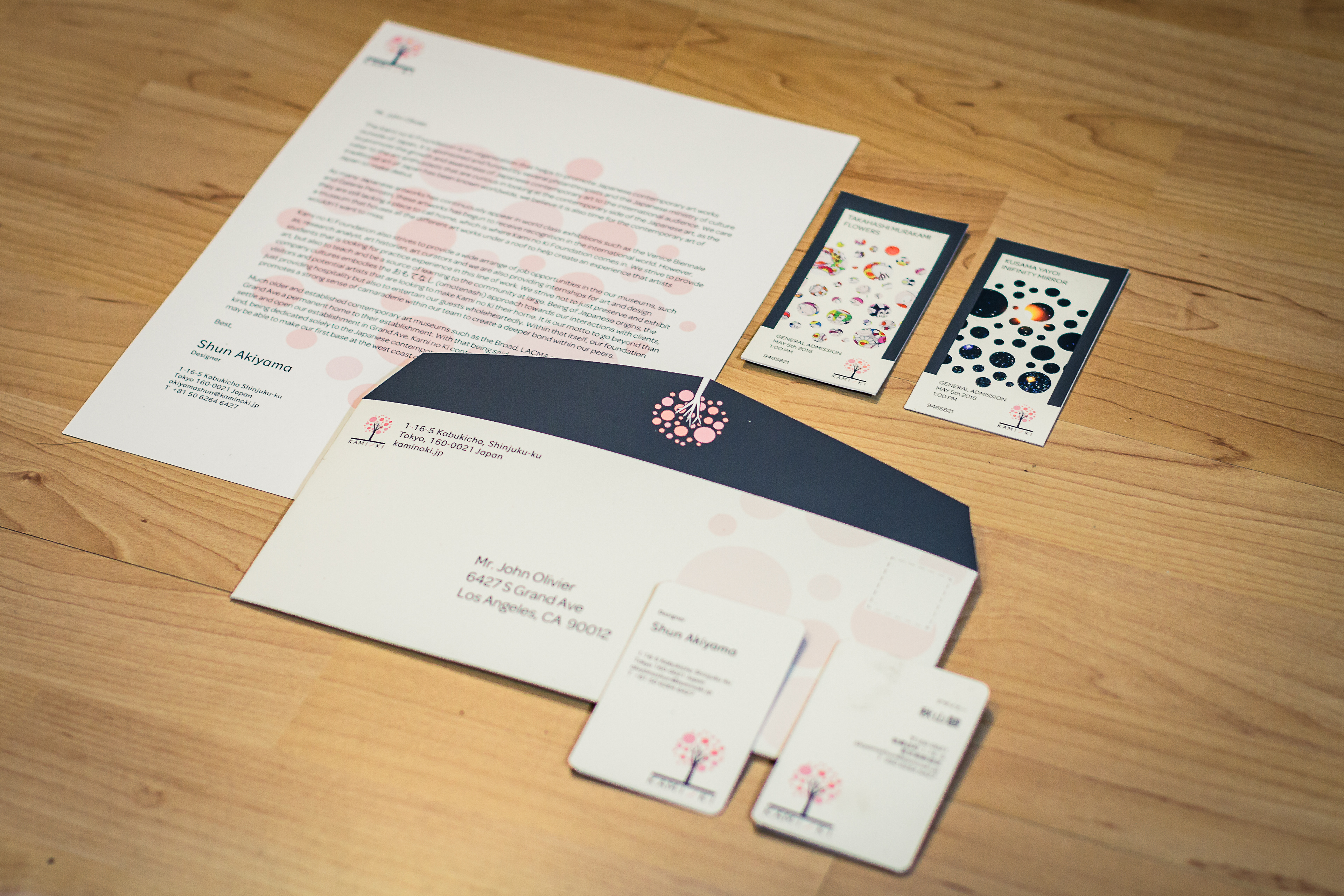
The identity set includes business cards, envelopes, paper stock, museum ticket cards and promotional posters for various exhibitions.
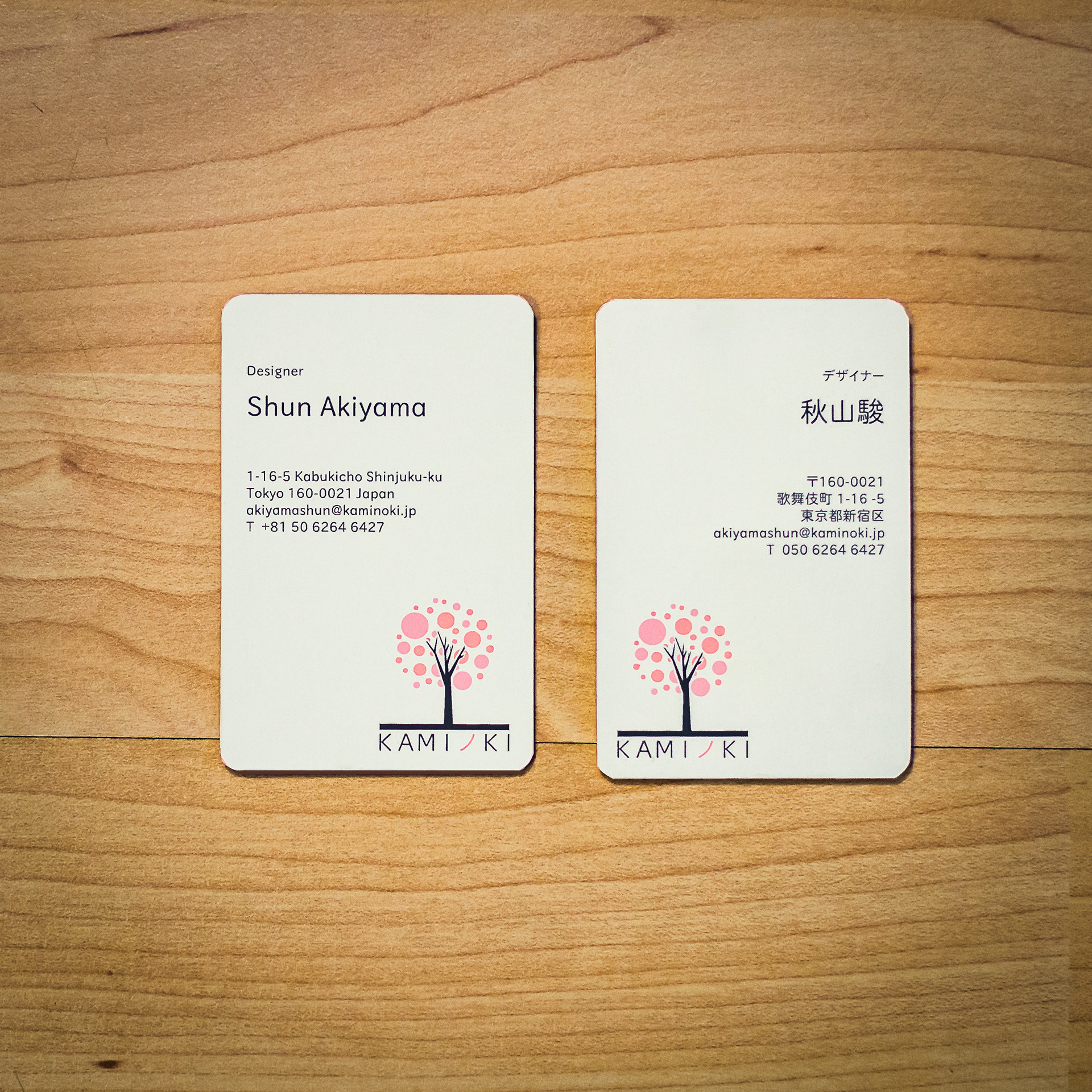
Both side of the business cards are done in different languages
TYPEFACE
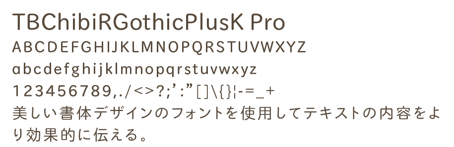
For the bilingual nature of the identity, KAMIノKI utilizes TBChibiRGothicPlusK Pro, the type identity goes for a rounded sans-serif look to distinguish itself from the usual block sans-serif look of other art foundation’s type identity.
For the bilingual nature of the identity, KAMIノKI utilizes TBChibiRGothicPlusK Pro, the type identity goes for a rounded sans-serif look to distinguish itself from the usual block sans-serif look of other art foundation’s type identity.